
Another Look at Neighborhood Analysis with Housing Data and Machine Learning
After exploring neighborhoods in LA, we apply our data-driven approach to a different landscape: the housing markets of Indiana

Building on our previous post, we continue experimenting with clustering methods applied to housing data, to classify neighborhoods and identify local trends.
When we think about neighborhoods, one of the first challenges we face is: how do we actually measure their profile and their change over time? We might rely on data about resident characteristics (income, jobs, or wealth) or on quality-of-life indicators such as amenities and crime rates. However, combining all of these into a single, coherent measure may require complicated weighting approaches that may lack interpretability.
There are, however, two basic facts that are intuitively true. First, the quality of the housing stock, especially single-family homes, is strongly correlated with the overall conditions of a neighborhood. Second, the development of new, high-quality single-family homes tends to occur in either already desirable neighborhoods or those that are actively undergoing gentrification.
These observations serve as the motivation for our approach. Instead of trying to measure every possible dimension of neighborhood life, we focus on the physical characteristics of the housing stock and on how these characteristics change over time. This offers an alternative method for classifying neighborhoods and identifying neighborhood change that is both practical and interpretable. The main challenge, of course, is that housing is highly complex and multi-dimensional. Anyone can walk down a street and get a sense of whether the homes are new, large, or in good condition, but so systematically with large datasets and statistical methods is much harder.
We tackle this challenge using a clustering algorithm called K-Means. This algorithm groups homes into buckets of similar properties. We then identify a manageable number of clusters that summarize the housing stock across the geographical area of interest.
For our exercise in this post, we work with data on residential parcel characteristics available from the Fitzgerald Institute of Real Estate at the University of Notre Dame and conduct a study of neighborhoods across the state of Indiana.
Defining Home Types in Indiana
We focus on single-family parcels, and collect all the available physical characteristics of homes, such as effective year built, square footage, number of bedrooms and bathrooms, number of stories, the presence of amenities like fireplaces or pools, and roof quality. Effective year built is not the original construction year of the building, but rather a date that reflects the current structure and wear-and-tear of the home. We collect data on about 1.7 million single-family homes in Indiana as of the end of 2024.
We deliberately exclude location among the characteristics of interest because our goal is to use the physical features of local homes to classify neighborhoods.
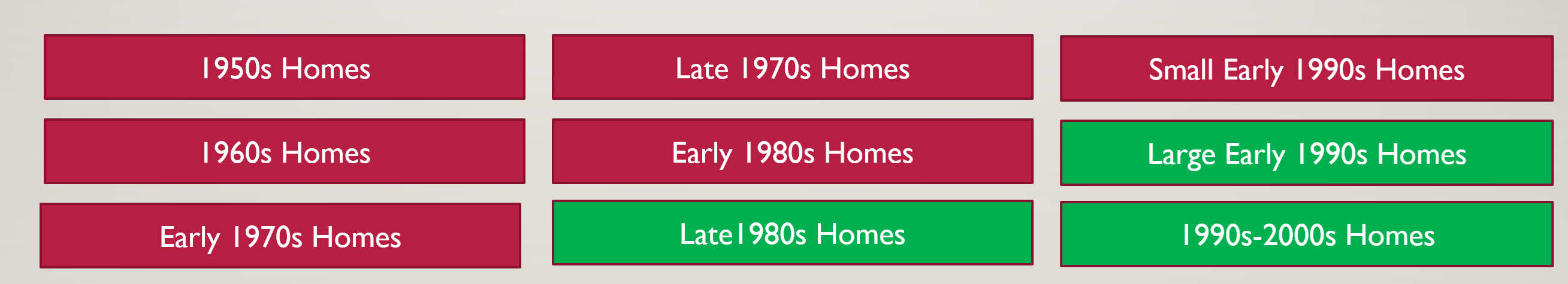
After running the K-Means algorithm, we identify 9 distinct clusters,1 which we label as shown in the figure below. Note that these are names that we assign post-clustering, given the housing stock composition; the algorithm was not directed to bucket homes in this way. However, it turns out that clusters are strongly determined by vintage and size. You can also notice that we highlight some clusters in red and some clusters in green. This is to visualize the split between clusters of homes that have better quality (in green), and homes that do not have as good quality.
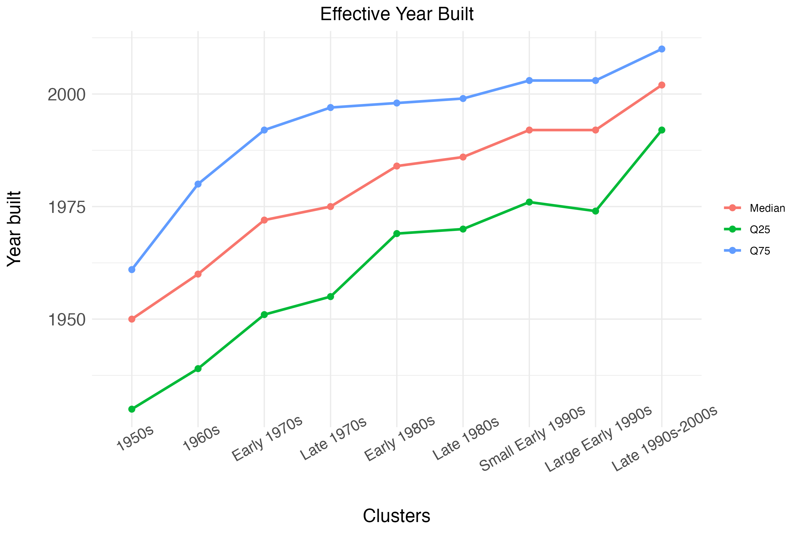
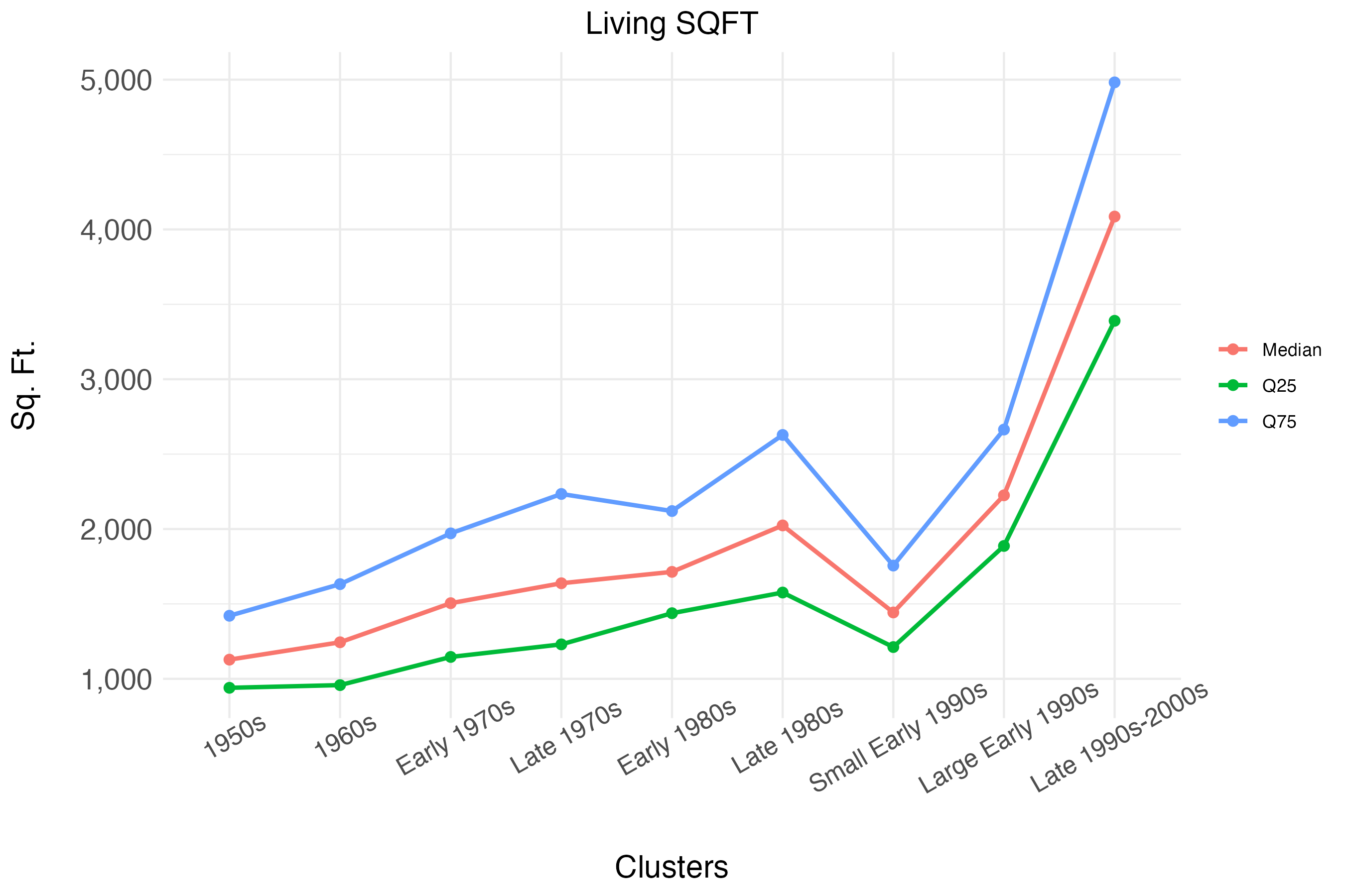
As mentioned, the definitions above are based on the prevailing characteristics within cluster. The figures below show, for each cluster, the median, top quartile, and bottom quartile of age and size. We can see that from left to right, the algorithm sorts homes into clusters belonging to different vintages, based on the effective year built. The differences in effective year built are substantially less pronounced when comparing the three clusters that we label as “Late 1980s”, “Small Early 1990s” and “Large Early 1990s”. However, these three clusters are substantially different in terms of home sizes, measured as living square feet. The median size for the “Late 1980s” cluster is 2000 square feet, the median size for the “Small Early 1990s” cluster is just 1,500 square feet, and the median size for the “Large Early 1990s” cluster is approximately 2,200 square feet.
The three clusters, “Late 1980s”, “Large Early 1990s”, and “1990s-2000s”, have the largest homes, with the third cluster having a median size of 4,000 square feet. These clusters also contain homes that tend to have a higher likelihood of having multiple stories and a higher likelihood of having amenities, such as fireplaces.
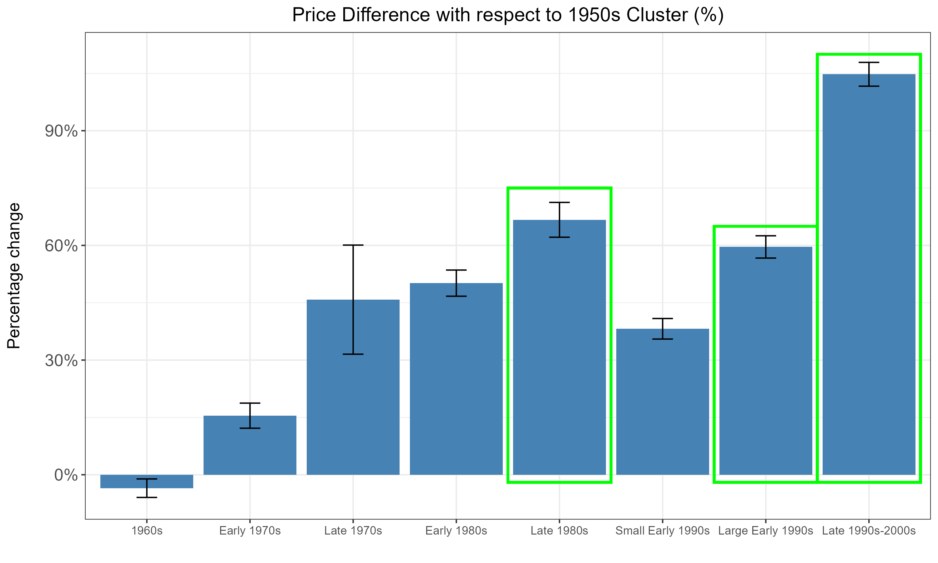
Do the clusters actually capture significant differences in the housing stock? We explore this by testing whether the clusters explain differences in house sales prices. Note that prices were not used in creating the clusters, and are an independent outcome. We look at sales of homes within the same census tract and year between 2010 and 2025, and thus compare prices across clusters while controlling for location and time of sale. The figure below reports estimates of the price premiums for all clusters with respect to the 1950s cluster. It is apparent that even within the same census tract and year, there are significant differences in prices for homes belonging to different clusters.
The “Late 1980s”, “Large Early 1990s”, and “Late 1990s-2000s” clusters have the largest premiums, equal to 70%, 60%, and 105%, respectively, which means that they are typically 60% to 105% more expensive than homes from the 1950s. This confirms that these three clusters combined capture the higher-quality homes in the state.
Classifying Neighborhoods Using Home Clusters
We then turn to classifying neighborhoods across Indiana using the local composition of single-family homes across clusters. We calculate for each census tract the share of “good quality” homes by pooling together the “Late 1980s”, “Large Early 1990s”, and “1990s–2000s” clusters.2 The map below shows how the share of good-quality homes varies across census tracts, and provides us with a perspective on the state of the single-family housing stock in Indiana as of the end of 2024 (the most recent update to our dataset).
We can see large heterogeneity, with the highest shares observed in the suburbs of Indianapolis and Fort Wayne, around Bloomington and south of Gary, in the north-west. We also observe large rural pockets where good-quality single-family housing is clearly scarce.
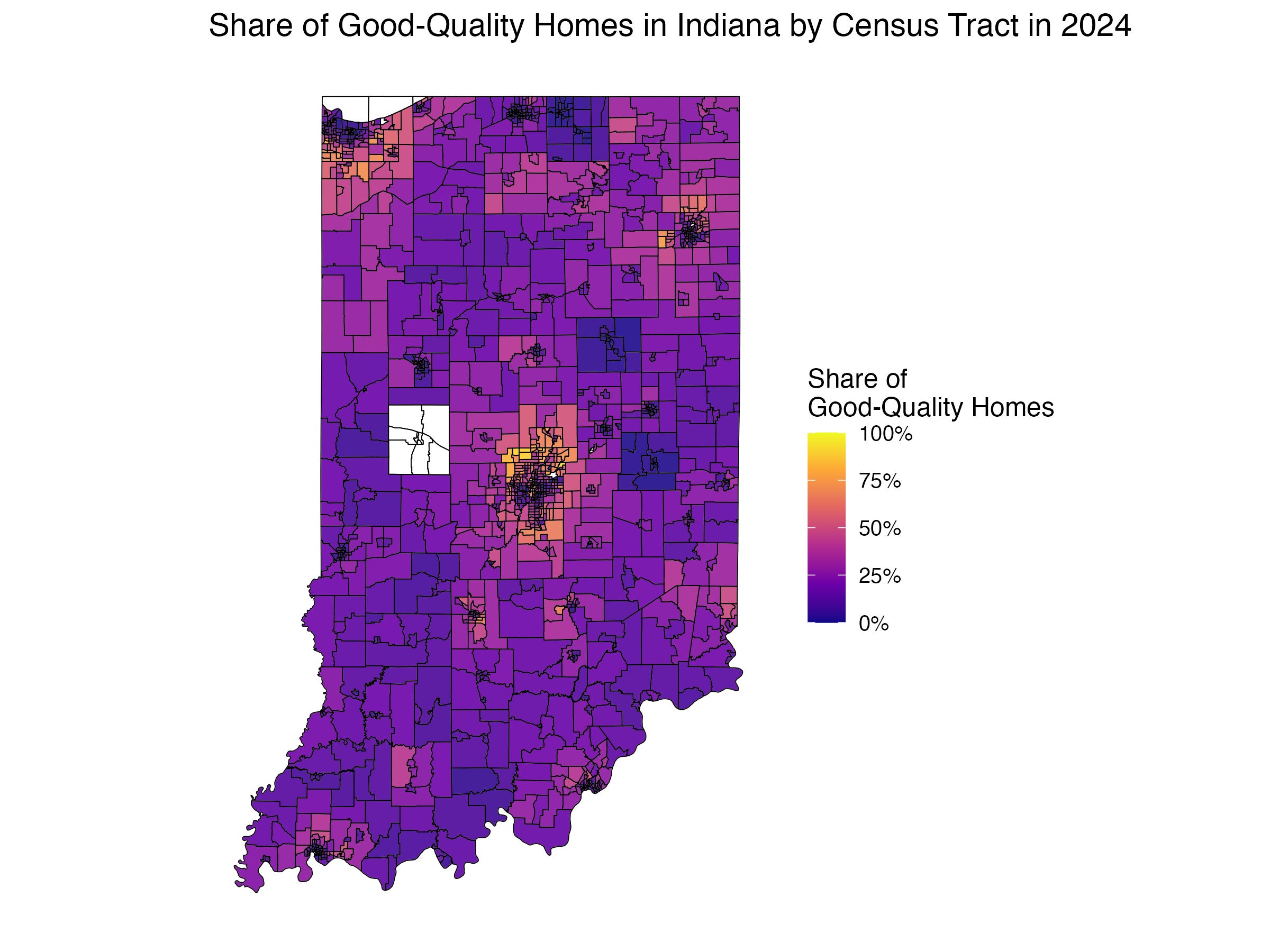
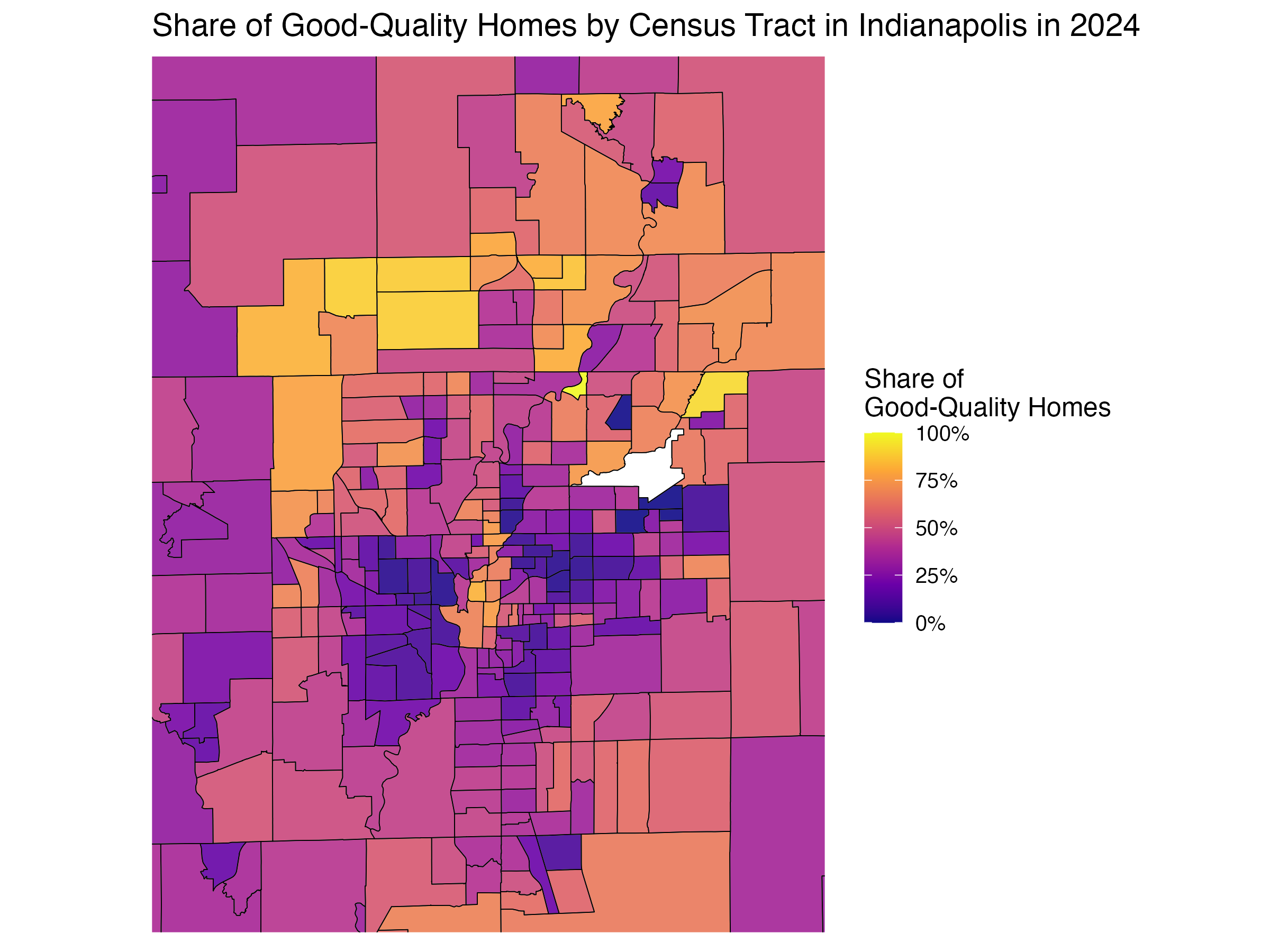
Zooming in on Indianapolis, we can see that the highest share of good-quality homes is located in the north of the city, particularly in areas to the north-west (such as Zionsville), and downtown. These neighborhoods have indeed experienced gentrification in recent years. On the other hand, the share of good quality stock is lowest in the areas surrounding downtown, especially to the south-west.
These patterns have important applications. Regulators, for instance, may want to identify pockets of underdeveloped or older housing stock to target redevelopment incentives. Developers may want to know which areas already have strong housing stock and where it is changing most rapidly, signaling opportunities for investment.
Analyzing Neighborhood Change in South Bend
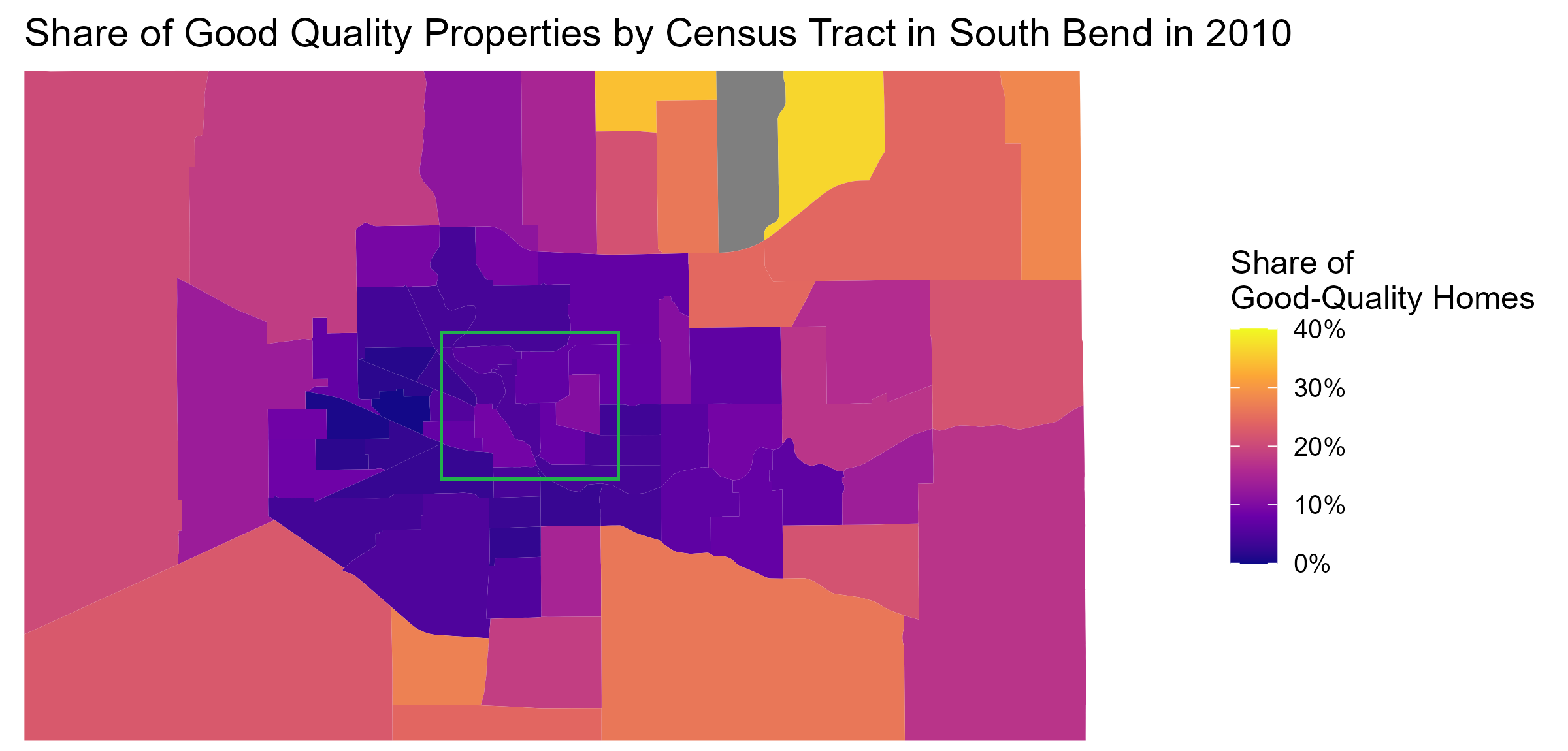
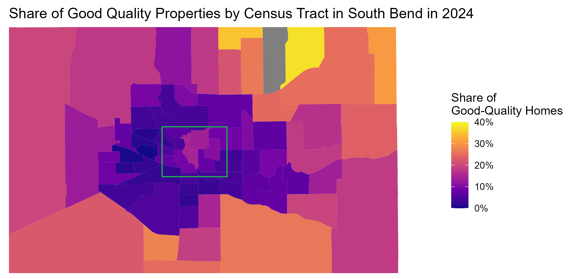
Our measure can also serve as a useful tool for tracking neighborhood changes over time. For this exercise, we focus on South Bend, where the University of Notre Dame is located. This city has undergone several requalification efforts over the last decade. To track the effects of these efforts on the housing stock, we study how the share of good-quality single-family homes has changed across census tracts from 2010 to 2024.
The first figure below plots the 2010 shares, and the second one the 2024 shares. Despite the relatively small size of the city, there is substantial disparity in the housing stock, particularly when comparing the northeastern suburbs against the core metropolitan area.
However, most census tracts have not experienced meaningful change over the last 15 years. The only areas that saw an increase in good quality housing stock are part of the central area of the city (within the green square). Here, we can see several tracts turning substantially lighter, with the share of good-quality homes increasing from around 10-15% to close to 30%. These neighborhoods correspond to the immediate surroundings of the Notre Dame campus and to the area between campus and the Saint Joseph River. They have indeed been the target of substantial residential redevelopment. However, spillovers of these efforts to the housing stock in the rest of the city appear to be still limited.
Conclusion
In conclusion, our clustering approach offers a compact and interpretable method for classifying housing stock across neighborhoods. The classification is strongly predictive of individual house prices. More importantly, it provides a new, data-driven measure of neighborhood quality and changes over time. With this measure, we can classify neighborhoods, identify underdeveloped areas, and systematically study neighborhood change.
We use the Elbow Method to select a parsimonious number of clusters. This approach gives us 10 clusters. However, one of the clusters contains only a few hundred homes, which have median effective year built in the 1950s and are built on very large parcels, mainly in rural areas. We remove these homes from our analysis.
We drop from from the analysis census tracts with less than 100 single family homes.