
A Metro-by-Metro Measure of the U.S. Housing Supply-Demand Gap
From 2019 to 2024, the housing supply in 105 large, growing metros grew about 15% slower than the number of households. Some metros lagged far more than others.

Housing shortages are the subject of heated debate across the United States. But the estimates that drive this debate (e.g., three to four million units short) are national in scope and hard to trace back to a transparent calculation. In this post, we build a simple, fully reproducible metro-by-metro measure, using data from the Census Bureau’s American Community Survey (ACS). We ask one question of each large U.S. metro: did the housing stock grow as fast as the number of households?
On average, across the 105 large metros where the number of households grew between 2019 and 2024, net housing stock expanded just fast enough to cover about 85% of new household formation. That amounts to a shortfall of roughly 220,000 units per year, or a little over one million units over five years. Seventy-nine of the 105 metros experienced supply growth slower than household growth. Most metros aren't catastrophically behind on an annual basis. However, they fall a little further behind each year, and vacancy rates keep tightening as a result.
Measurement
We use two measures from the American Community Survey (ACS) 1-year estimates, comparing 2019 to 2024 for each metropolitan statistical area:
New Supply is the net change in total housing units (2024 minus 2019, divided by five). This is new construction net of demolitions and conversions, and equals what was actually added to the stock.
New Demand is net household formation (the change in the number of households over the same window, divided by five). It captures how many new households formed and needed a place to live.
The gap ratio is new supply divided by new demand. A ratio of 1.0 means a metro added exactly as many units as new households; below 1.0 means that the number of new households outpaced new supply, above 1.0 means the stock grew faster than the number of households.
This a deliberately simplified calculation, and has many limitations. Both household formation and new development are endogenous equilibrium effects in each metro, and demand and supply contemporaneously influence each other. However, this measure also provides a simple, stylized benchmark that requires few assumptions.
We restrict attention to U.S. metros with at least 500,000 residents and positive household formation, which leaves us with a total of 105 metros.
The Housing Gap Across U.S. Metros
The figure below provides a summary of the housing gap across U.S. metros. Each dot is a metro, sized by population and positioned by annual household formation (horizontal) against net new housing units (vertical), both per 1,000 residents. The dashed line marks parity between new supply and new demand. Most metros sit below it, which implies that new supply is lagging new demand.
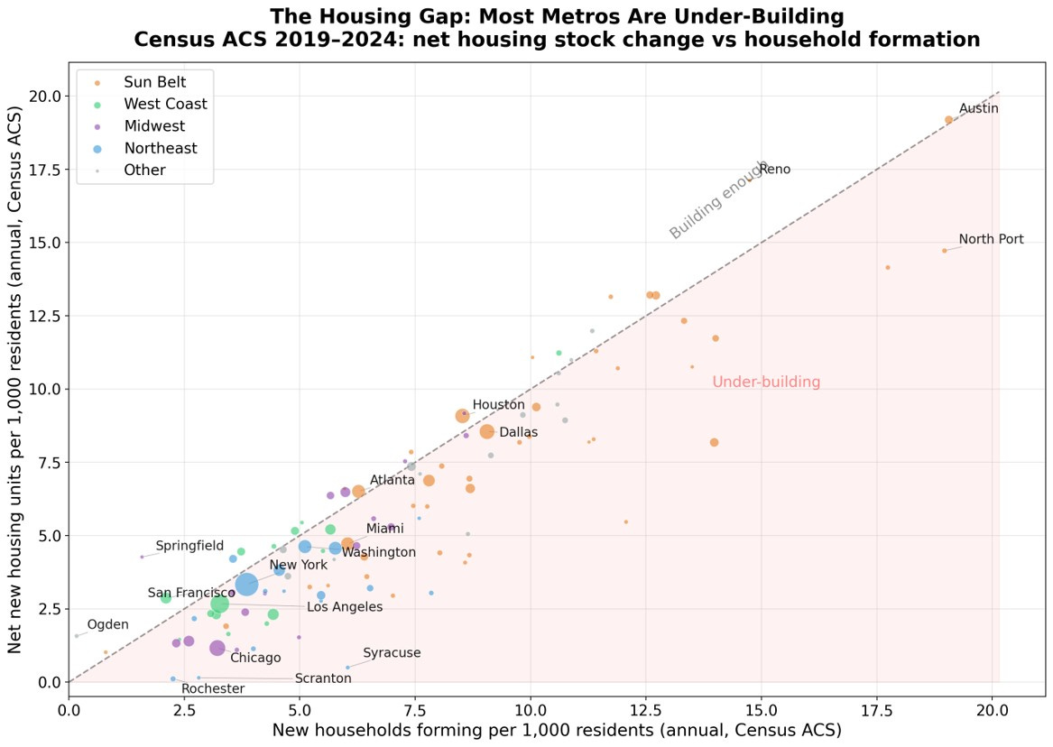
The Sun Belt metros are on the right side of the scatterplot. They have built the most in absolute terms. However, many Sun Belt metros still fall short of their own rapid household growth: Orlando, Tampa, Phoenix, and Dallas have increased supply quickly, but not quite quickly enough. Houston and Austin are the notable exceptions, sitting on or just above the parity line.
The Midwest and Northeast cluster in the lower left, with slow household formation and even slower construction. Chicago is the starkest case: roughly 30,000 new households a year against only 11,000 net new units.
How Far Behind Are the Largest Metros?
The figure below shows the gap ratio for the 40 most populous metros. Each label also reports the change in the vacancy rate over the period.
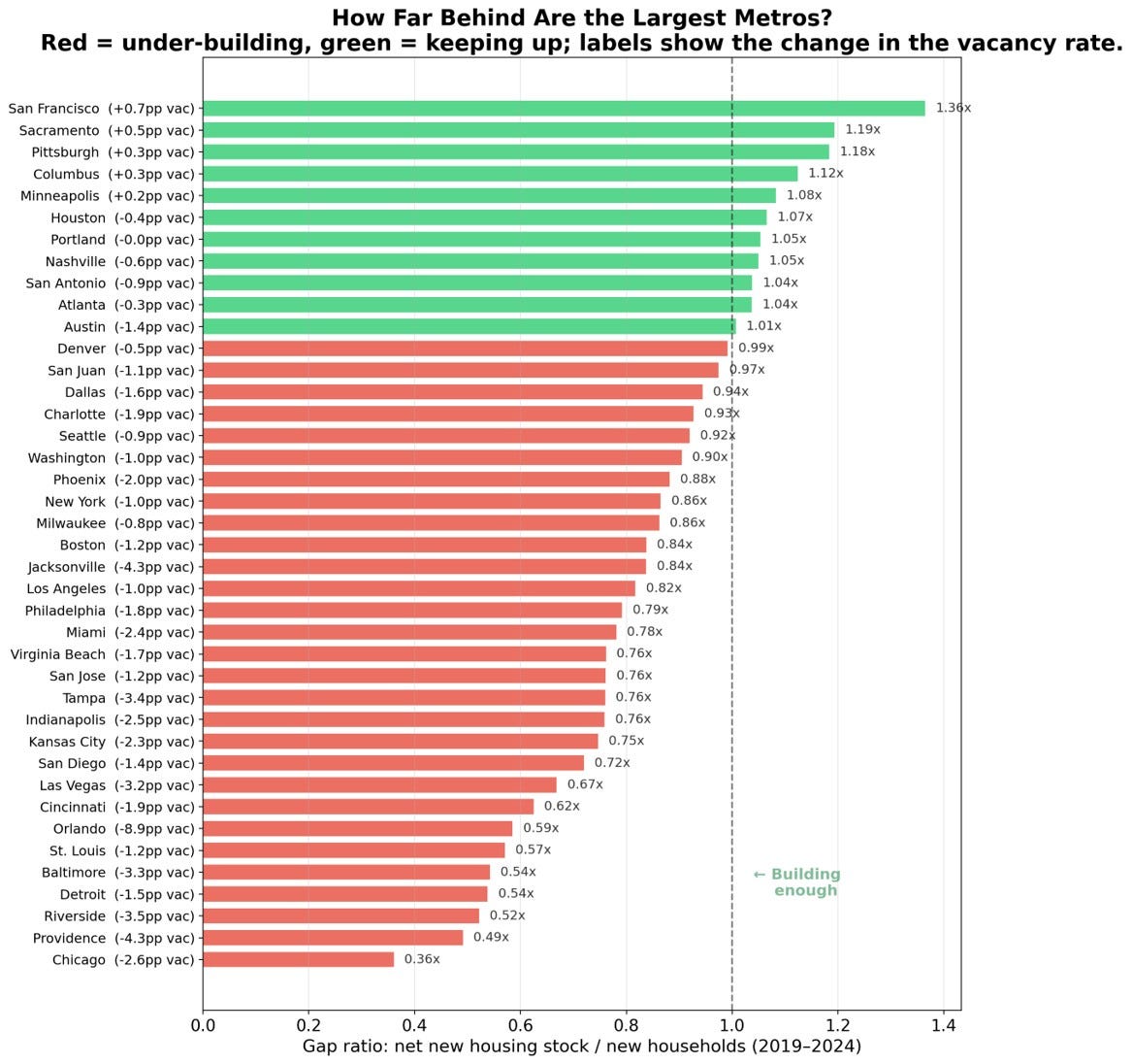
Chicago is the worst large metro, with a gap ratio of 0.36: for every ten new households, it adds fewer than four net new units. The vacancy rate correspondingly fell 2.6 percentage points over the five years. Riverside (0.52), Detroit (0.54), and Baltimore (0.54) follow, and among the fast-growing Sun Belt metros, Las Vegas (0.67), Tampa (0.76), and Orlando (0.59) are all seeing new demand outgrow new supply, despite their reputation for sprawling development.
At the other end, San Francisco is the most surprising result, with a gap ratio of 1.36, well above one. The metro synonymous with housing scarcity added stock faster than households formed over this period. The explanation, however, lies partly in weak demand growth: the post-2020 population outflow held household formation to just 49,000 over five years, while roughly 67,000 units came online.
Houston (1.07), San Antonio (1.04), Atlanta (1.04), Nashville (1.05), and Columbus (1.12) were all building more than enough to meet their growing populations. These are metros that combine steady construction with relatively permissive land use.
The Gap Ratio and Vacancy Changes
In addition to the gap ratio, we also use vacancy rates to gauge how much slack each market started with in 2019, and how much remains in 2024.
The figure below plots the gap ratio against the change in the vacancy rate. Metros that added less new supply than new demand sit in the lower-left band, where a shrinking vacancy cushion shows up as a falling vacancy rate. The handful of metros with new supply outpacing new household formation drift toward rising vacancy.
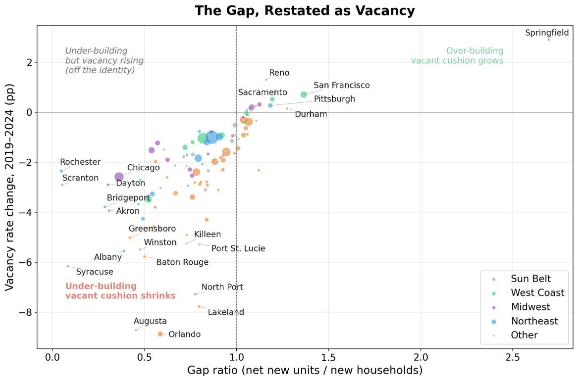
For example, Orlando had an unusually high vacancy rate of 17%, which then fell by 9%, down to 8%. Caution applies when interpreting the results for metros with the largest vacancy swings: ACS vacancy is gross vacancy, which includes seasonal and second homes. The sharpest declines are in Orlando (−8.9pp), Augusta (−8.7pp), Lakeland (−7.8pp), North Port (−7.3pp), and Syracuse (−6.2pp). Several of these metros are vacation and retirement markets, where seasonal units crucially contribute to the vacant stock. Thus, in these cities the drop also reflects second homes converting to year-round use.
Conclusion
We find that between 2019 and 2024, on average across large metros in the U.S., newly built units (net of demolitions) matched 85% of new household formation. While this gap is not massive, it has contributed to falling vacancy and a tightening of housing markets across the country, worsening the housing supply shortage.
The distribution of the gaps across cities reveals some interesting facts. Chicago, not San Francisco, has the worst gap among major metros, and several Rust Belt and Midwest metros have new supply lagging new household formation.
Houston, the standard example of permissive zoning, is building more than enough to accommodate new household formation. The same is true for Nashville, Columbus, San Antonio, and even Portland, Oregon.
For policymakers, the implication is that “the housing shortage” is really a collection of local gaps, and that uniform national targets will fit few of them well. For researchers, this exercise is a reminder of how much can be learned from simple stylized benchmarks constructed using ACS public data.